Trellick
Trellick
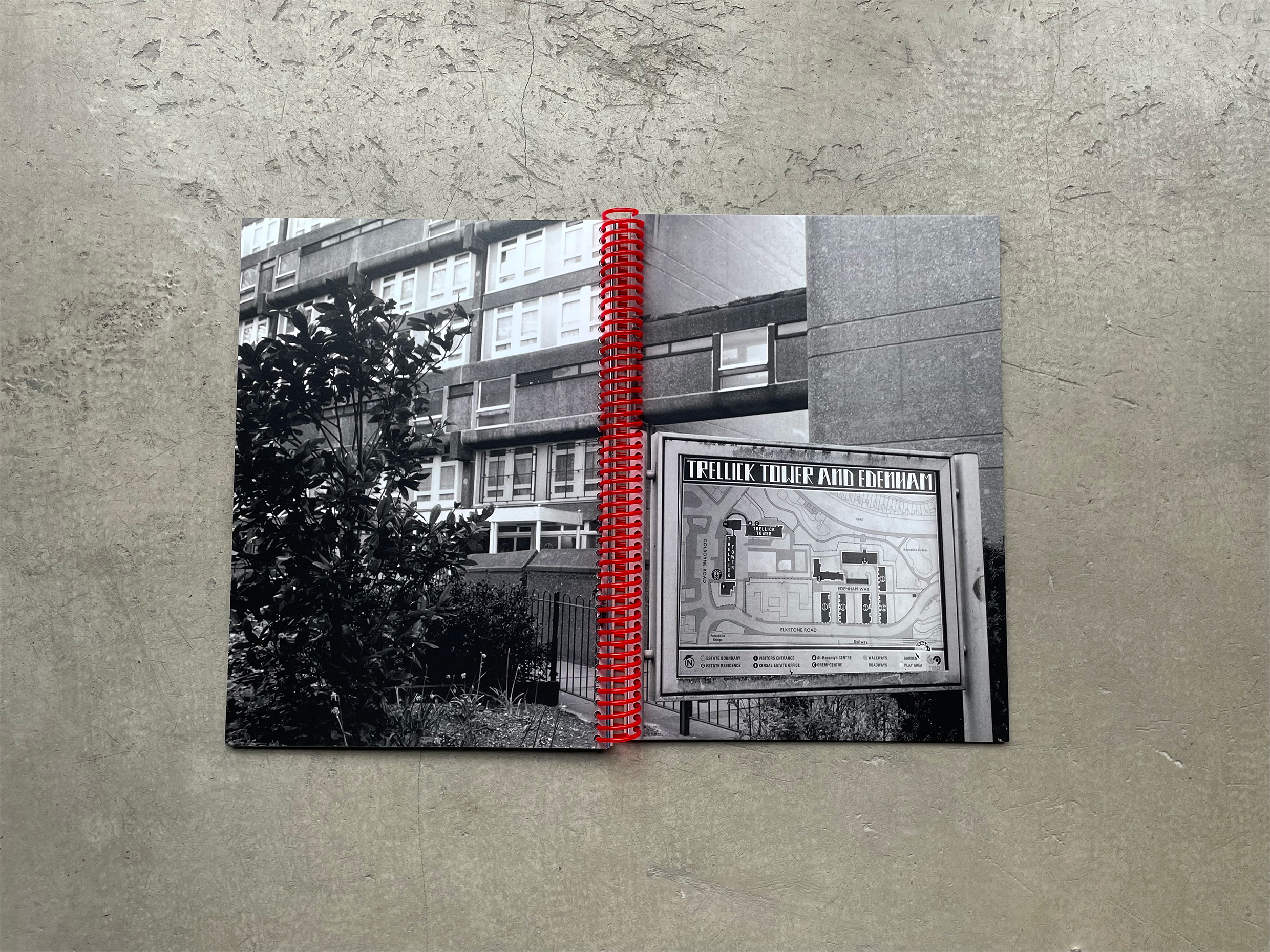
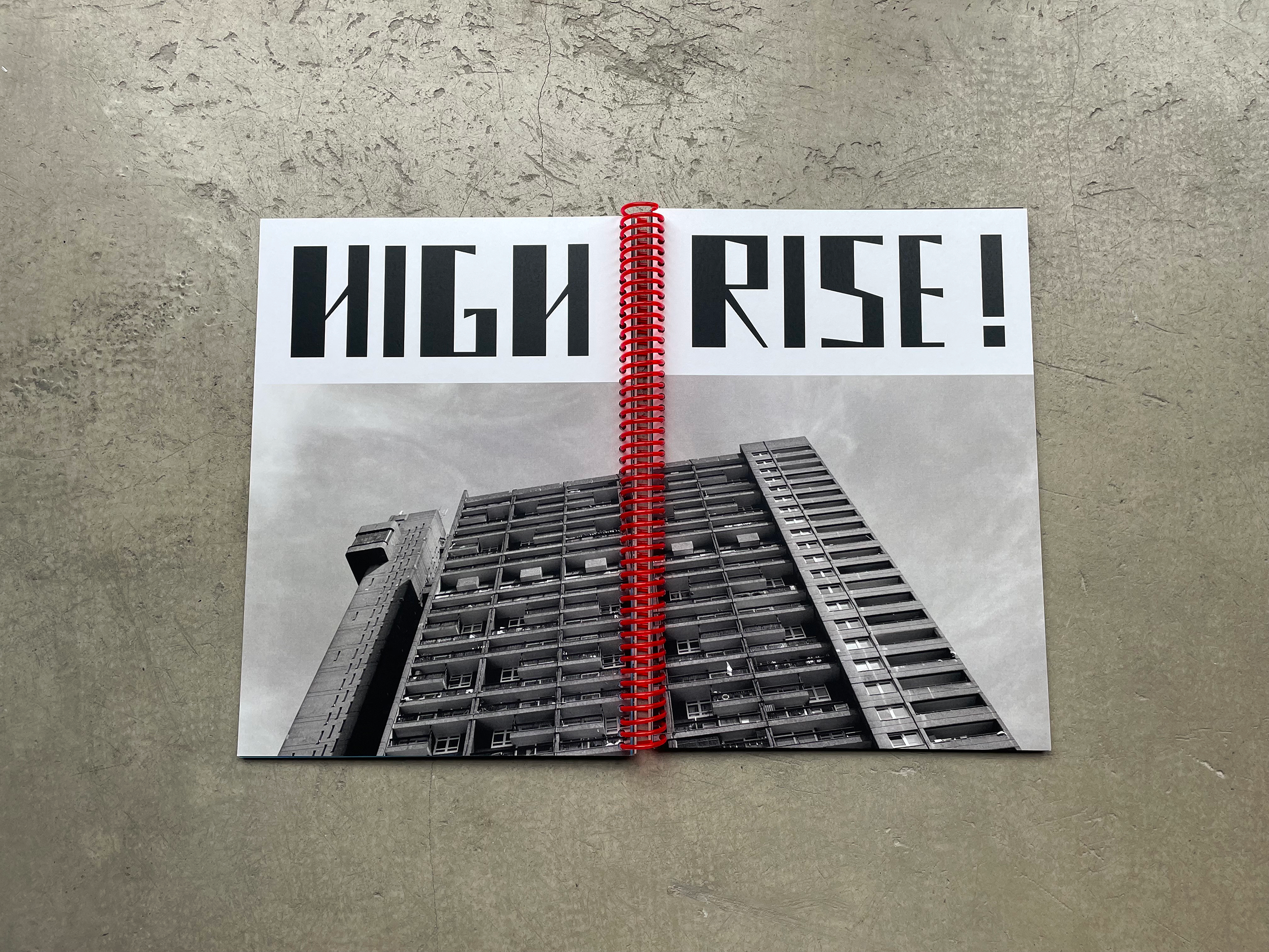
Trellick is a display font I designed based on the iconic Trellick Tower in the London borough of Kensington & Chelsea. Much like the architect, Goldfinger’s, humanist, utopian housing ideals, the font is best viewed at large scale. The font is designed contracted of 2 main blocks, one thick and an elevator tower much thinner. The diagonal connectors are taken from the idea that when you look up at the tower it appears diagonal and also because of the shadows formed on the tower. The tower can be described as starkly aggressive and I wanted this typeface to have this appearance. The kerning on the letters is designed to be close much like the community that resides in Trellick. The tower opened in 1972, it had been commissioned by the Greater London Council and designed in the Brutalist style by architect Ernő Goldfinger. I chose to base my typeface on Trellick Tower as this is a building I grew up near, and I was always fascinated by its overwhelming appearance.